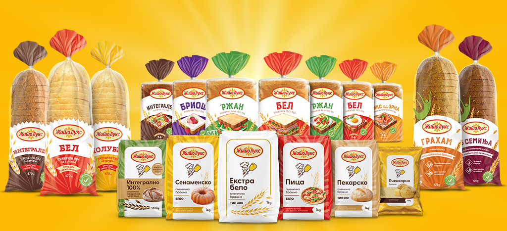
On February 15th Zito Luks unveiled its new visual identity, showcasing new colours, a new logo, and a modern design for all packaging.
The upgrade of the brand’s existing appearance is a decision made by the company after a series of consumer opinion surveys and their perception of the brand.
“It’s a huge challenge to make a change, especially when dealing with an established brand with a long tradition and great market success. But times bring the need for changes in all fields. In addition to the series of investments Zito Luks made in improving and advancing the production process and product quality in recent years, these changes needed to be supported by modernizing our appearance, thus strengthening the perception of buyers, especially the younger generations, towards the brand” stated Dimitrios Plakoutsis, the CEO of Zito Luks.
The colours and shapes of the new logo connect the two sources of life, the sun and bread, and its dynamism reflects the company’s aspiration for constant movement towards positive small and big changes that will further enable growth, development, and prosperity.
The energy radiating from the new packaging aims to further emphasize the top quality of Zito Luks products as a prerequisite for creating satisfied and loyal consumers.
“In all elements reflecting our new visual identity, we wanted to emphasize the symbolism while retaining the tradition built over 78 years by many generations who, through their work and effort, succeeded in making Zito Luks a leader in the milling and bakery industry” said the representatives of Zito Luks.