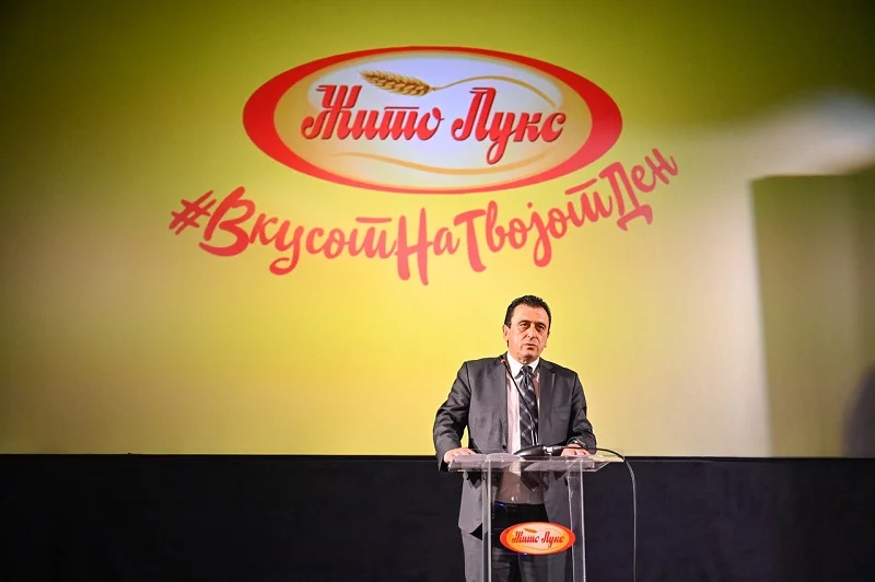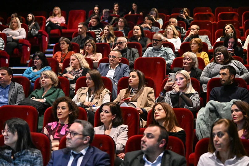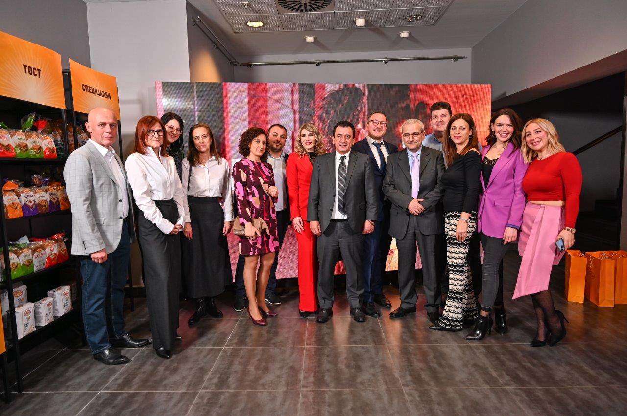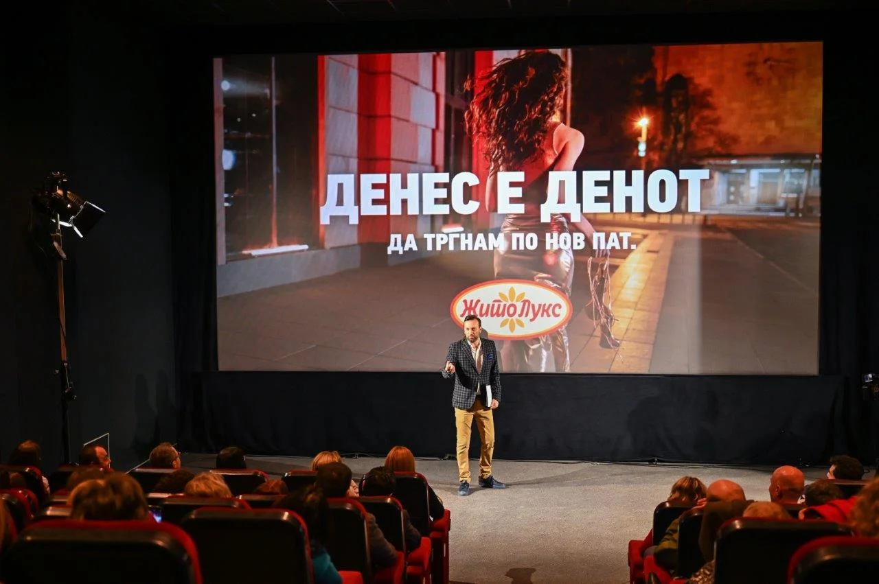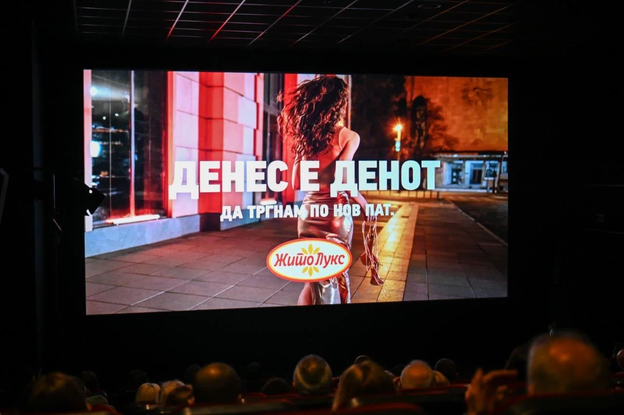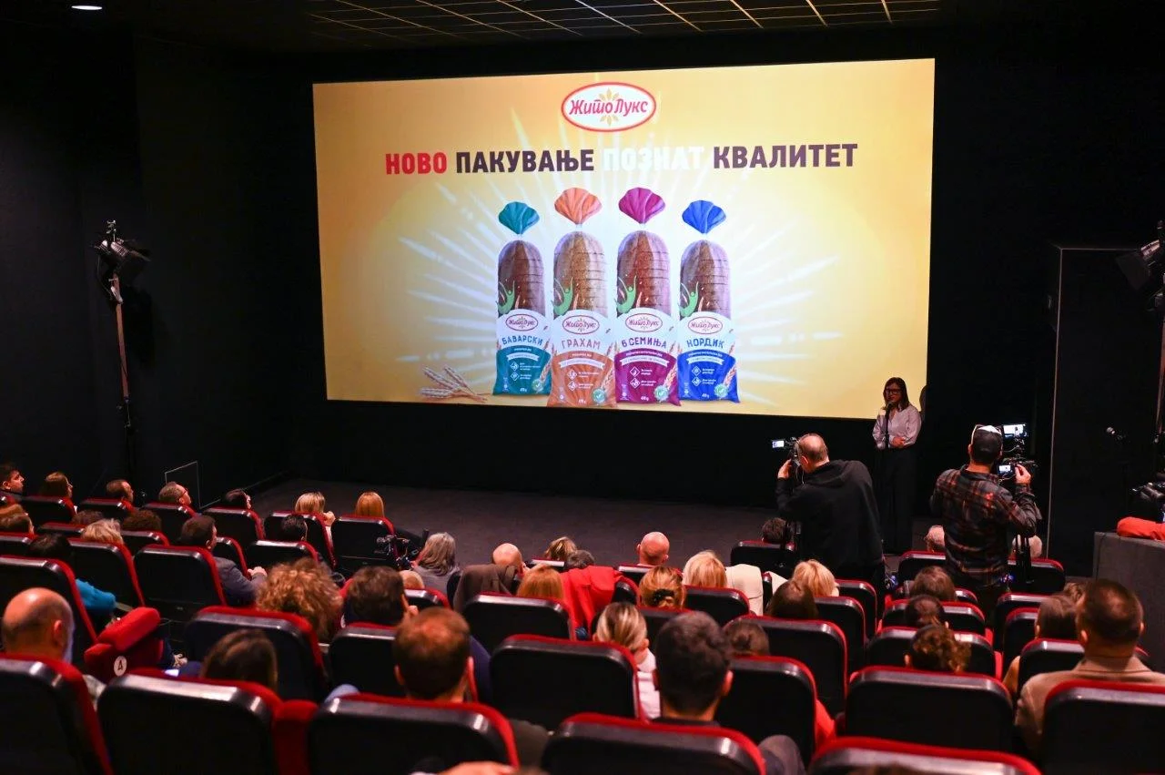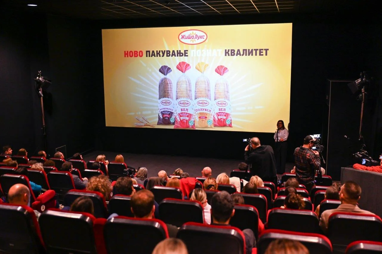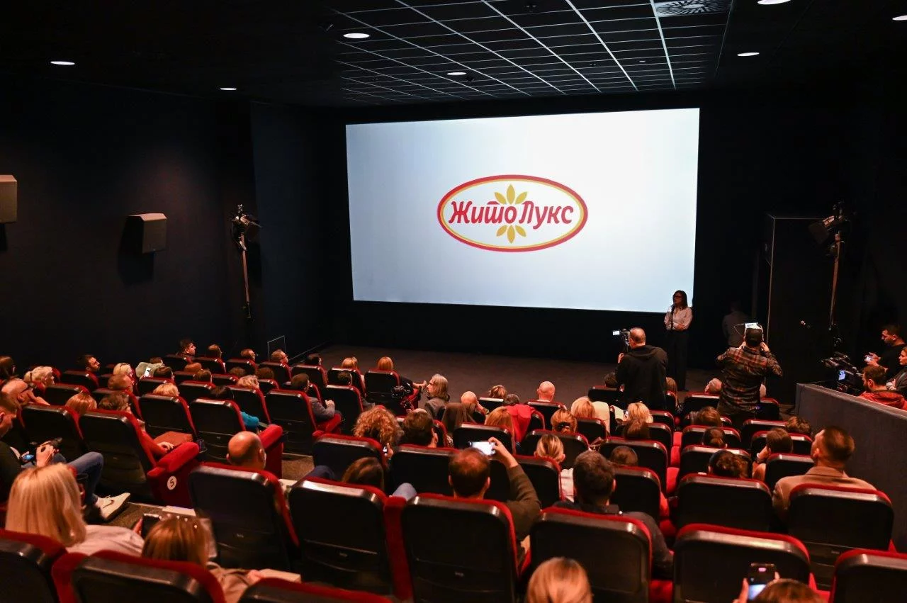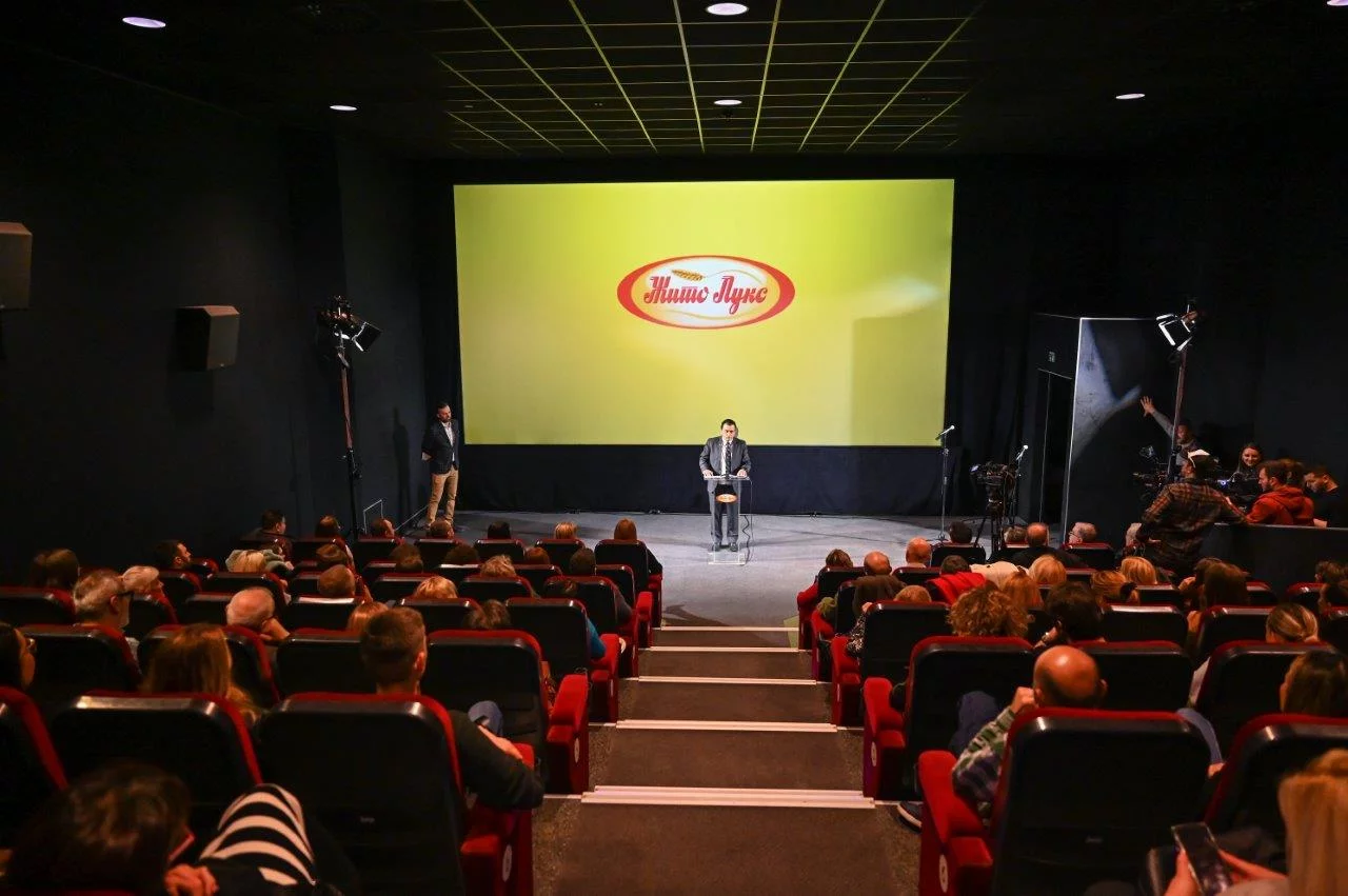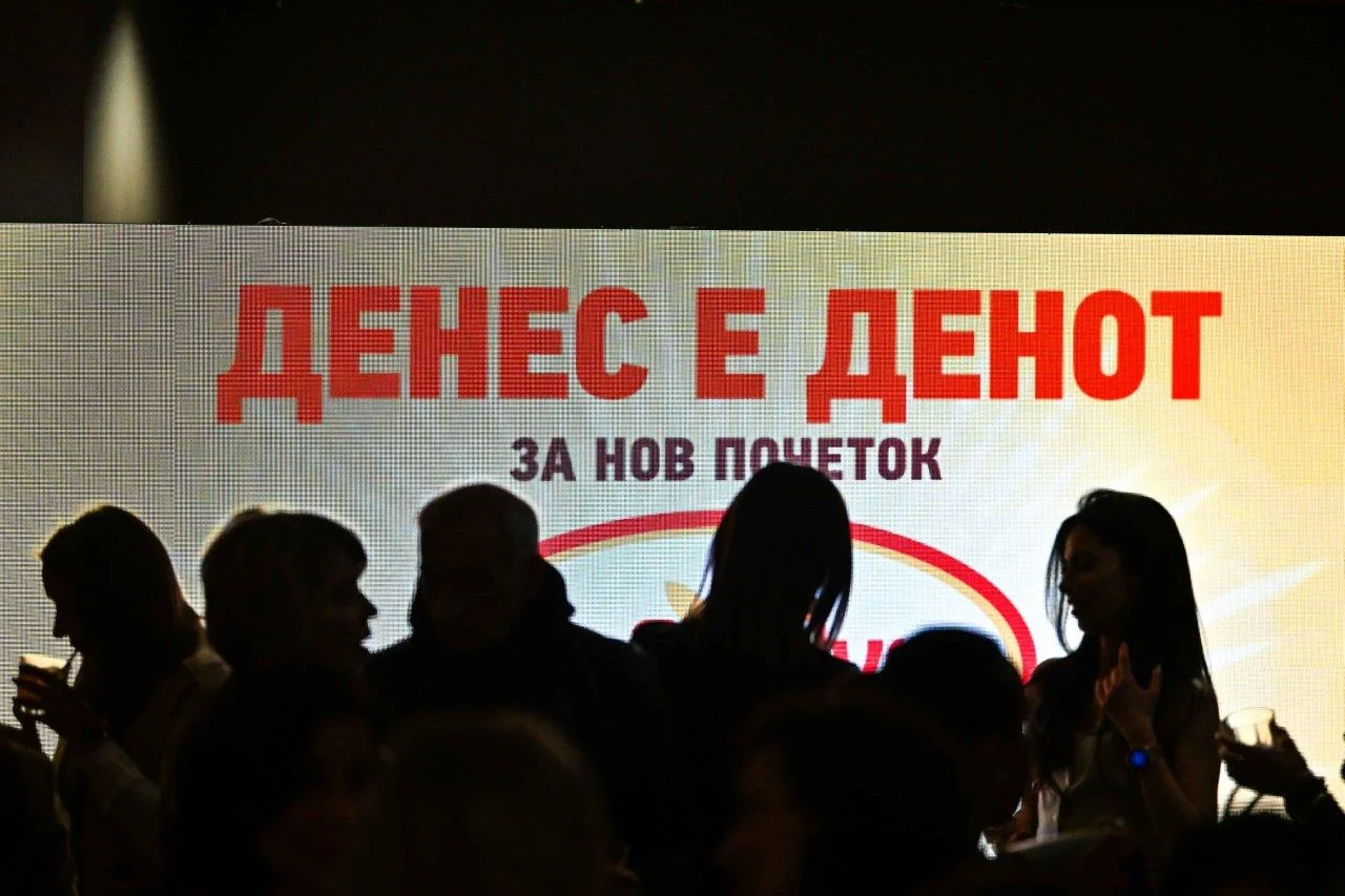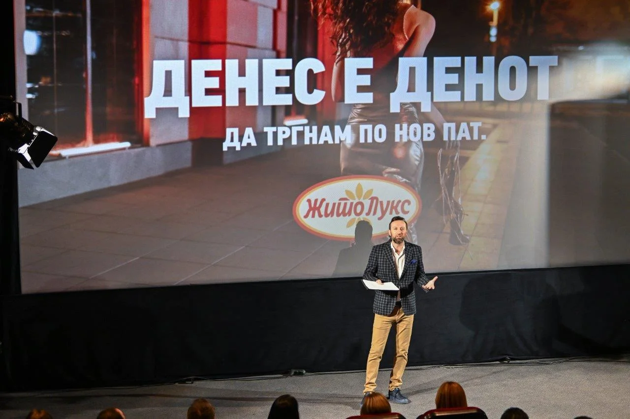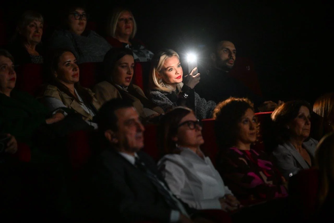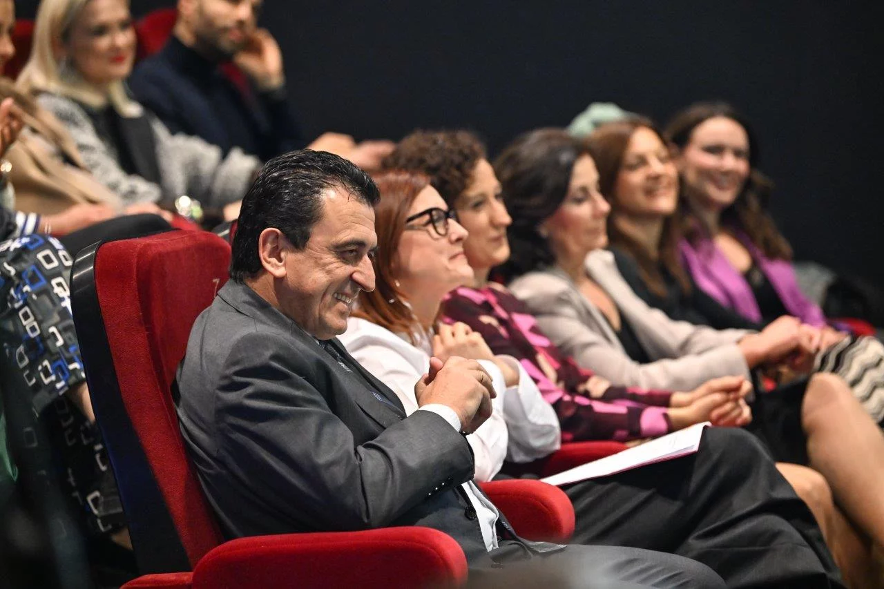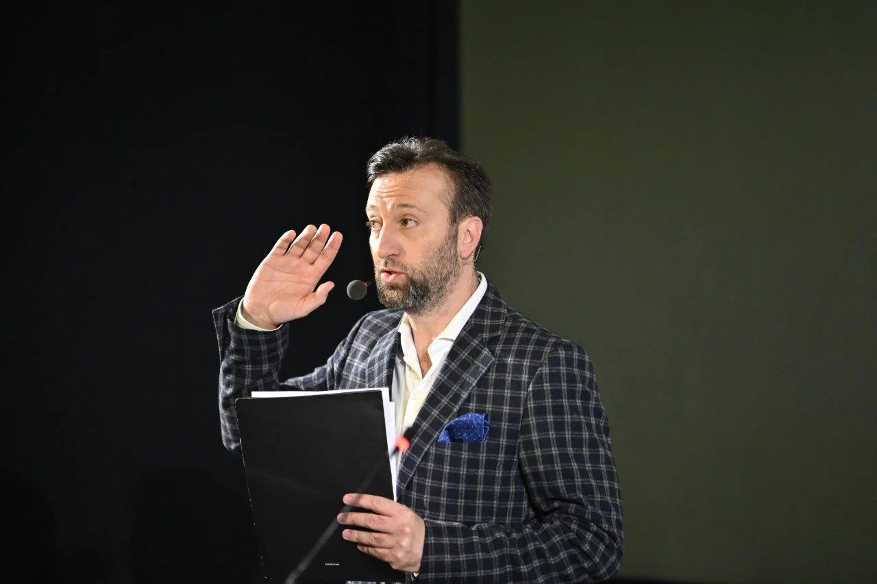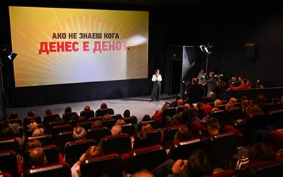
On February 15, at Cineplexx, Zito Luks presented the new visual identity, showcasing the new colors, new logo and the new, modern design of all packages. The company presented the new appearance, as well as future development plans, to journalists, public opinion makers, employees and some of its consumers.
The improvement of the existing appearance of the brand is a decision the company made after a series of surveys of the opinion of consumers and their brand perception.
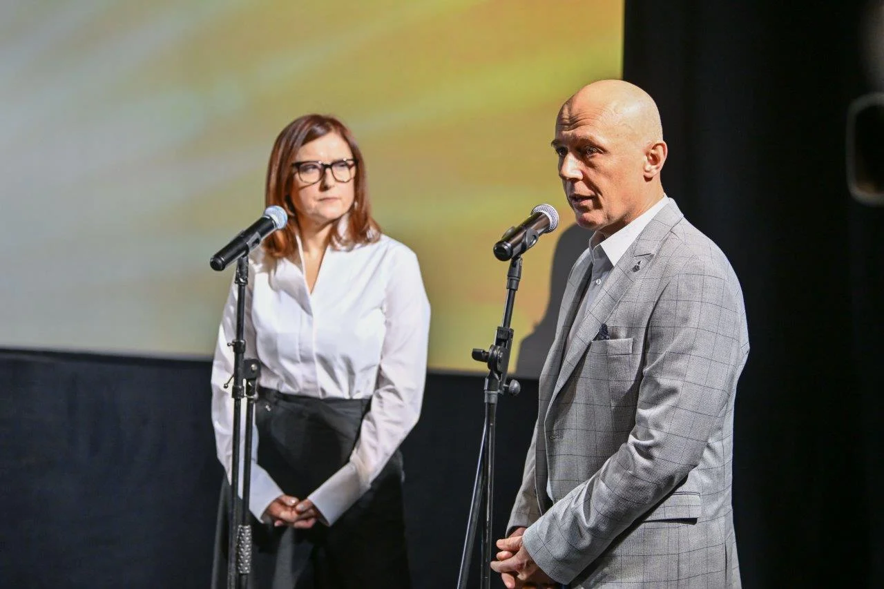
“It is a huge challenge to make a change, especially when it comes to an established brand with a long tradition and great success in the market. But times bring with them a need for changes in all fields. In addition to the series of investments with which Zito Luks has been working on the improvement and advancement of the production process and the quality of the products in the last few years, it was necessary to support those changes with the modernization of its own appearance, which would strengthen the perception of buyers, especially the younger generations for the brand” – said the general manager of Zito Luks Dimitrios Plakoutsis.
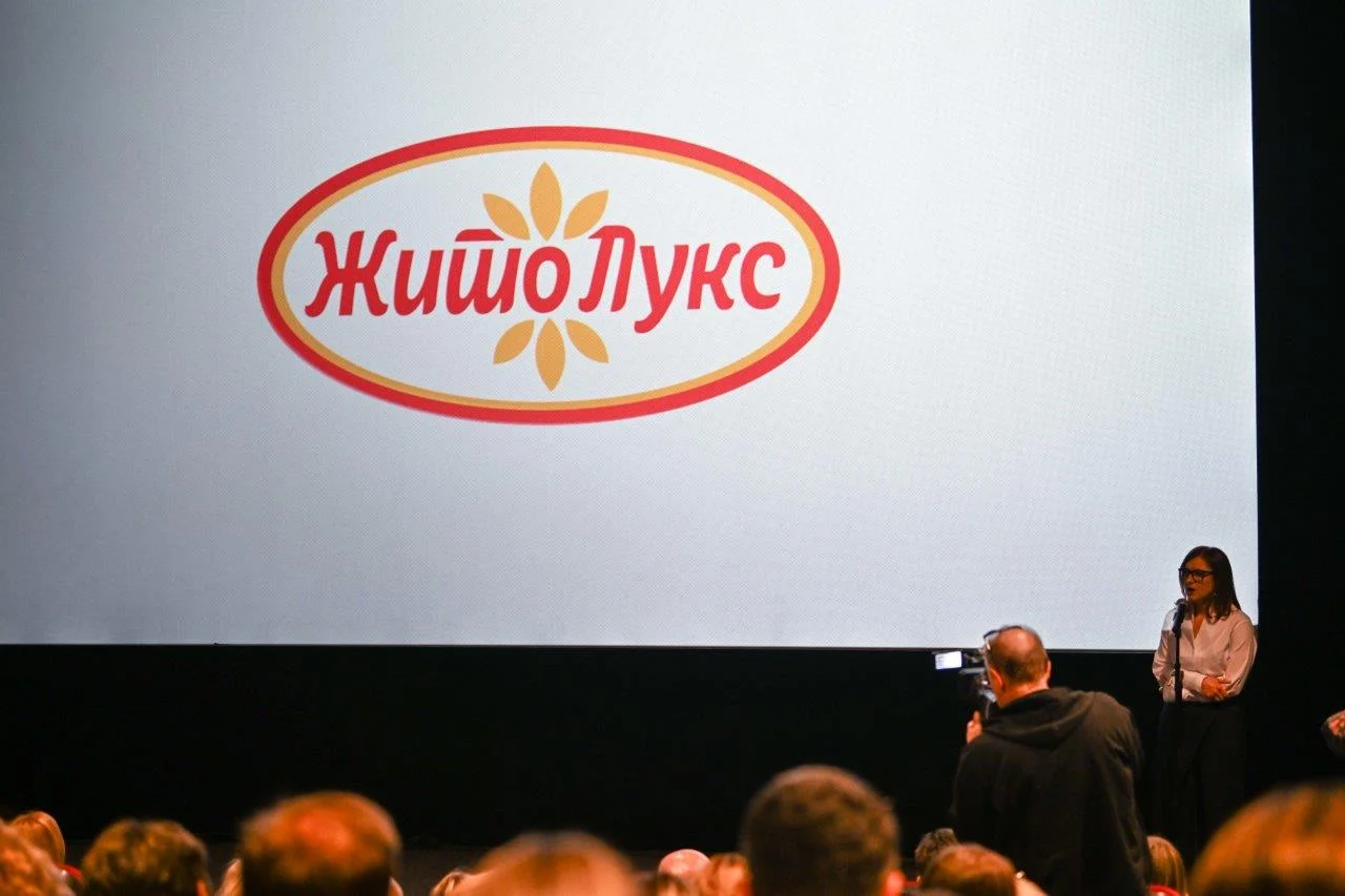
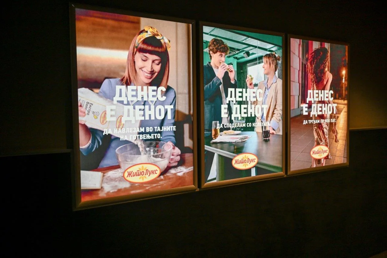
The colors and shapes of the new logo connect the two sources of life, the sun and bread, and its dynamics reflect the company’s aspiration for constant movement in the direction of positive small and large changes that will further enable growth, development and prosperity.
The energy radiating from the new packaging aims to further emphasize the top quality of Zito Luks products as a prerequisite for creating satisfied and loyal consumers.
“In all the elements that reflect our new visual identity, we wanted to emphasize the symbolism, but also to keep the tradition that has been built for 78 years by many generations who, with their work and effort, managed to create Zito Luks as a leader in the milling and baking industry” – as said from Zito Luks.